

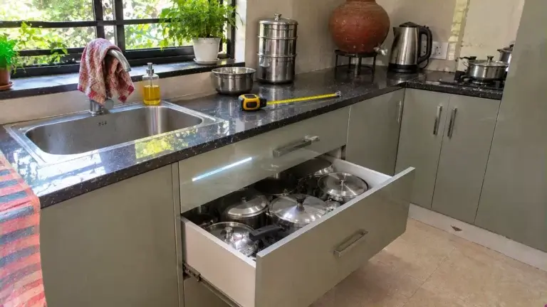
Modular Kitchen Design
Kitchen Drawer Design: Sizes, Runners and Soft-Close Tips
Planning kitchen drawer design? See base-drawer sizes in mm, soft-close runner checks, pots and pans depth and cutlery tray fit.
November 6, 2026
Modular kitchen color combination should follow your light, your counter and your cooking. A light upper over a mid-tone matte base suits most Indian kitchens. View two samples in your own kitchen at three times of day, then check them against your granite or quartz.
Sixty laminate swatches look equal on a showroom table. Below are eight palettes, the counter and light checks, and the mistakes that show up after installation.
Every palette in the table below comes from Bhumim’s own colour guide. We list who each suits and what to watch, because a trend that photographs well can still be hard to live with. Which of these has your family seen in a friend’s kitchen?
Of the 8 palettes, 5 lean on warm wood or cream, which is why they feel easy to live with. The other 3 lean on a strong dark or green shade, so they need more care with light and finish. We suggest shortlisting 2 palettes, not 8, before you ask for samples.
Palette | Suits | Watch out for |
White and warm wood | Most kitchen sizes | Gloss white shows every mark |
Sage green and cream | Kitchens near a window or balcony | Sage shifts shade with the light |
Navy and white | Open kitchens, strong light | Dark matte shades show scratches |
Charcoal grey and walnut | Heavy daily cooking | Too much grey feels cold |
Warm taupe and brass | Larger kitchens | Taupe can feel heavy in small rooms |
Olive green and off-white | Homes that like earthy tones | Olive needs a light upper to balance it |
Pastel blue and light grey | Families wanting soft colour | Needs light to stay fresh |
Matte black and natural wood | Statement kitchens | Black alone reads heavy |
The latest modular kitchen colour combination in Indian homes leans towards earthy greens and warm neutrals over plain white. We think the palette matters less than the finish and the board behind it, so read on before you choose.
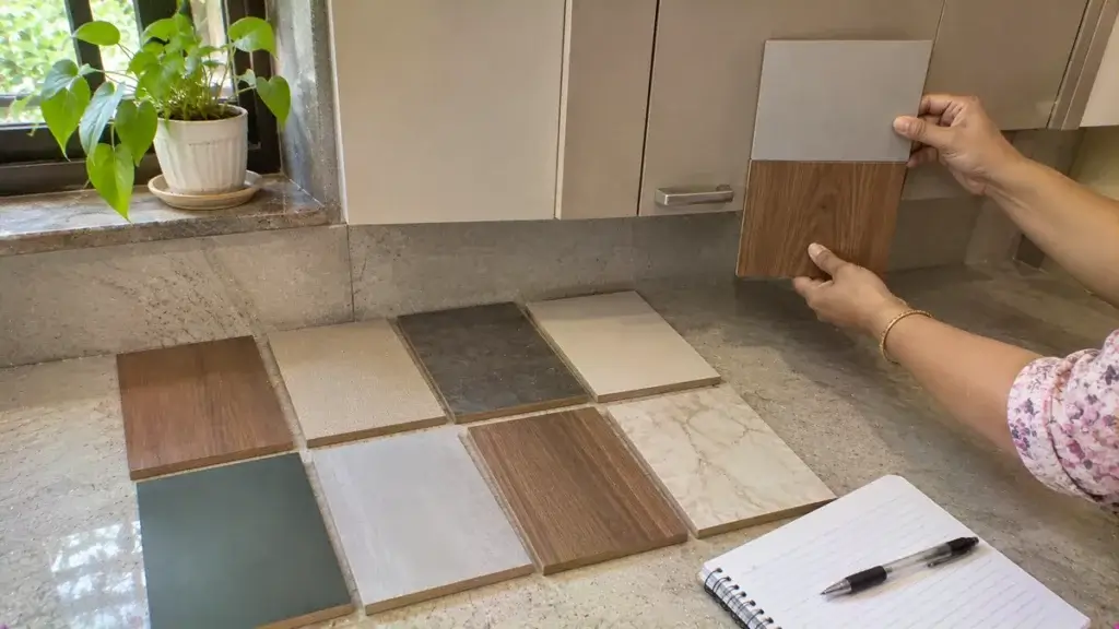
Bhumim’s guide asks three simple questions before it suggests any palette at all. First, which way does the main kitchen window face? A north-facing window gives cooler, indirect light, so warm tones such as cream and soft beige work better than cool greys. South and east light is strong for most of the day, so navy or olive stay vivid.
Second, how big is the kitchen in feet and inches? A narrow parallel kitchen behaves differently from a large U-shaped one. Light colours open a compact room, while bolder palettes anchor a bigger one.
We think this third question matters most, and buyers ask it last. Third, how often do you cook in a normal week? A kitchen that sees three Indian meals a day, with mustard, turmeric and oil, needs mid-tone matte shades that hide daily marks. In Noida, taller buildings often block light, so lighter palettes forgive more. In Dehradun, bright hill light keeps deeper colours alive.
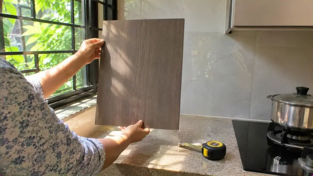
For expert design consultation, send us your details and we’ll schedule a call
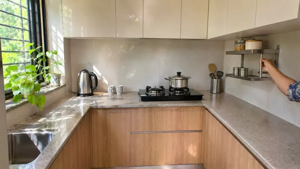
For a compact kitchen, Bhumim’s guide uses a light, reflective tone on the uppers and a slightly warmer mid-tone on the lowers. White or cream uppers over a pale wood base is a practical choice. It lifts the room and still feels warm in the evening.
In a compact kitchen, avoid dark colour on every surface. One dark accent, such as the lower cabinets or a single backsplash wall, adds depth without shrinking the space. If you use one light tone everywhere, allow one accent surface at most.
A small kitchen also shows a colour mistake much faster than a large one. A sample that looked soft in the catalogue can turn grey in a room with one window. Does your kitchen get direct light, or only a bounce from the passage?
Grey earns its place in Indian kitchens because it hides marks and grease better than white. Bhumim’s guide pairs charcoal grey with walnut brown, so the kitchen feels confident without turning cold. Pastel blue with light grey is a softer option, and both colours hide daily smudges well (the guide lists both among its 8 palettes).
On the other hand, a grey kitchen with a grey counter and a grey floor can feel flat. Keep at least 1 warm surface among the 3 largest ones, and let that surface decide the mood of the room.
A Quora reply on an L-shaped open kitchen suggests four pairs: grey with white, blue with white, black with white and faint brown with white. It adds one rule, which is to take a sample first. We agree with that rule more than with the list.
The catch is light, and we suggest checking it before you fall for the photo. A north-facing kitchen has no direct daylight to wake a cool grey, so the same laminate feels flat there. Warm it with a wood tone or brass-toned handles, and keep the counter lighter than the cabinets.
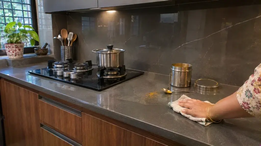
Many Indian kitchens already have a black granite slab. In a Houzz thread on cabinet colours for black granite, a professional suggests white uppers over dark base cabinets. The black granite and the dark base anchor the space together. The same poster likes a simple subway backsplash and light walls, and matches any tall unit to the uppers.
Other owners in that thread chose off-white, cream, maple or cherry. A second Houzz thread on light cabinets with black granite adds a warning for Indian cooks. Honed stone shows stains from vegetable oil, while a leather finish keeps a matte look and shows no marks.
So we recommend that you pair black granite with white or cream uppers and a mid-tone base, and ask for a leather or polished finish. Two threads, two warnings: keep the contrast moderate, and test the stone finish with 1 drop of oil before you sign off. Bhumim’s guide notes that a navy and white kitchen looks very different on white quartz and on black granite. Plan all three surfaces together, since each one changes how the others look.

Two-tone kitchens put a darker or mid-tone matte laminate on the lowers, where hands and cloths touch most, and a lighter one above. Reliable pairs from Bhumim’s guide are matte navy with gloss white, matte walnut with off-white, and matte charcoal with satin cream. For the navy route, see our blue kitchen cabinets guide.
A mid-tone lower with a bright upper reads more balanced than black under white. Is your kitchen used every day by children and elders? Then a satin finish on both is more forgiving. Start with 2 pairs from the 3 listed above, and limit the kitchen to 2 main colours plus 1 handle tone.

Layout changes how a palette reads from the doorway. In an L-shaped kitchen, light uppers with mid-tone lowers or a two-tone scheme separate the two working walls. The table below gives Bhumim’s approach for each common layout, with the reason it works.
Layout | Colour approach | Why it works |
Straight | Light uppers and lowers in one tone | Keeps the single wall flowing |
L-shaped | Light uppers, mid-tone lowers | Separates the two working walls |
Parallel | Light, reflective tones on both sides | Stops the corridor feeling narrow |
U-shaped | Light uppers, one accent lower on the sink wall | Adds a focal point |
Island | Bold island, neutral cabinets | The island becomes the anchor |
Small kitchen | One light tone, one accent at most | Fewer breaks make the room feel larger |
For parallel and L-shaped kitchens in Noida flats, white or cream uppers with a warm mid-tone lower maximise width and light. They also need less cleaning to look tidy after a week of regular cooking.
In an L-shape, the corner is where two colours meet. Look at that one joint on a sample cabinet before you approve the full set of modules, because it is hard to change later. We think the corner is the first place a bad pairing shows. Which wall of your kitchen gets the stronger light, the sink wall or the hob wall?

Finish changes how a colour behaves in daily use. Matte hides fingerprints and light scratches, though it can hold cooking grease if you do not wipe it after cooking. Gloss and acrylic wipe clean and brighten a small room, yet they show fingerprints at once. Our laminate, acrylic, membrane and PU comparison covers cost and heat risk.
For three meals a day, Bhumim’s guide calls satin or semi-gloss the practical middle. It adds that the board behind the finish matters more than the shade you pick from the catalogue. In Dehradun, where humidity changes through the monsoon, HDMR is recommended under any laminate or acrylic. MDF costs less but absorbs moisture sooner than HDMR.
Edge banding shows in a two-tone kitchen, so ask for a sample cabinet with an exposed edge. Dark matte shades also need a scratch-resistant laminate, since they show every mark. Ask the maker to write the grade on the quote. Then ask for 2 sample doors, 1 matte and 1 satin, and wipe both with a damp cloth at home for a few minutes.
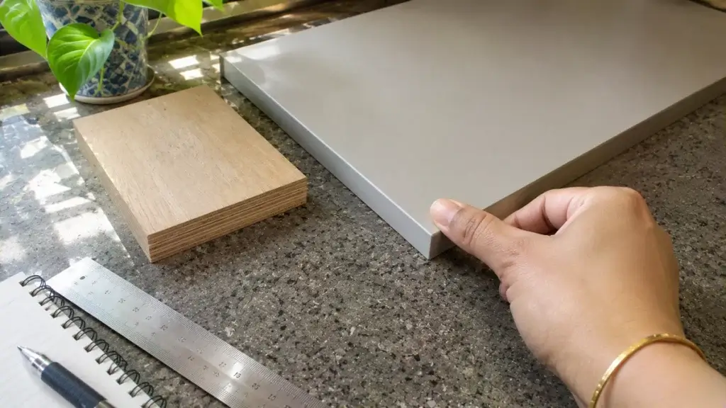
Vastu advice on colour is not settled between the published guides. Bhumim’s kitchen Vastu guide reviewed published guides and found they do not match. One names beige, cream and light yellow and avoids heavy dark shades. Another names warm yellow, orange and light red, and a third gives orange, pink, red or brown for the south-east.
The same guide notes that green links to the east and north-east in Vastu terms. That is why our sage green kitchen guide suits some homes. Pick two light, warm samples and test them in your own kitchen light. A colour that suits your light is a safer rule than a list. Across the 3 guides we compared, no two gave the same colour list. That is why we would not choose a palette on that basis alone.
Bhumim’s guide suggests a neutral base with the trend colour only on the island or one accent wall. That version ages better over the years and stays pleasant to live with for longer. Which one surface in your kitchen could carry the bold colour on its own?
Want your palette checked against your own kitchen size and light? Share your kitchen size and the two colours you like, and review them in a free 3D design. Call or WhatsApp 08044630777 or fill in your details at bhumim.com.
White or cream uppers over a warm wood, navy or sage green base is the most balanced choice in Bhumim’s guide. It reflects light, handles heavy cooking and stays stylish. The final pick depends on kitchen size, window direction and the countertop you already have.
Earthy palettes lead in Bhumim’s guide: sage green with cream, warm taupe with brass, olive with off-white, and white with warm wood. Matte finishes suit these tones well. Treat any trend as a base to test with samples, since a palette that dates fast is a poor buy.
Use light, reflective tones such as cream, pale beige, soft white or light wood. Bhumim’s guide advises one light tone across uppers, lowers and walls and no more than one dark accent. Fewer visual breaks make a small kitchen feel larger, so avoid dark colour on every surface. Keep at least 1 light tone across 2 or 3 surfaces.
A Houzz professional suggests white uppers over dark base cabinets with a subway backsplash and light walls. Other owners chose off-white, cream, maple or cherry. A second thread warns that honed black granite shows oil stains, so ask for a leather or polished finish.
Yes, grey hides marks and grease better than white, which helps with heavy Indian cooking. Bhumim’s guide pairs charcoal with walnut and pastel blue with light grey. Add warm wood or brass-toned handles, because cool grey can feel flat in a north-facing kitchen without direct daylight.
Put a darker or mid-tone matte laminate on the lowers and a lighter one on the uppers. Bhumim’s guide lists matte navy with gloss white, matte walnut with off-white, and matte charcoal with satin cream. Keep the contrast moderate and test both under your own lighting.
For an L-shaped kitchen, Bhumim’s guide suggests light uppers with mid-tone lowers or a two-tone scheme, which separates the two working walls. A Quora reply lists grey with white, blue with white and faint brown with white, and says to take a sample first.
Published guides do not agree, as Bhumim’s Vastu guide found. One names beige, cream and light yellow, another warm yellow, orange and light red. Green is linked to the east and north-east. Pick two light, warm samples and test them in your own kitchen light.
Call or WhatsApp Bhumim at 08044630777, or fill in your details at bhumim.com/contact. Share your kitchen size, your window direction and the 2 or 3 colours you like, and the team shows the palette in a free 3D design, typically within 3 to 7 days.
A good modular kitchen color combination starts with your light and your counter, not a trend list. Pick a palette, test two samples at home and fix the board and finish in writing.
If you are planning a kitchen in Dehradun, Haridwar, Noida or nearby, call or WhatsApp Bhumim at 08044630777 or reach out through bhumim.com/contact for a free 3D design.
Published by: Bhumim India Private Limited-Modular Kitchen Manufacturer & Installer, Dehradun
GST: 05AAOCB1784F1ZM | ISO 9001:2015 Certified
Service Areas: Dehradun · Haridwar · Rishikesh · Roorkee · Noida · Ghaziabad
Contact: 08044630777 | hello@bhumim.com
Note: This article is written from Bhumim’s on-ground manufacturing and installation experience. All material recommendations are based on what we use in real kitchens across our service areas.
Planning kitchen drawer design? See base-drawer sizes in mm, soft-close runner checks, pots and pans depth and cutlery tray fit.
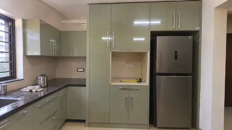
Planning a kitchen tall unit? See sizes in mm, oven and fridge housing rules, a worked cost example and a checklist for 1 to…

Kitchen corner cabinet options compared: blind corner, magic corner, carousel and drawers, with sizes in mm, load limits and cost.