

Modular Kitchen Color Combination: Top Picks for 2026
Modular kitchen color combination in 2026 is trending toward natural, calming palettes-sage green with cream, navy blue with white, warm taupe with brushed brass, and white with warm wood tones. Earthy neutrals and two-tone upper-lower cabinet schemes are dominating Indian homes because they balance aesthetics, practicality, and long-term durability.
What is a modular kitchen colour combination?
A modular kitchen colour combination is the coordinated set of colours applied across cabinet fronts, wall panels, countertops, and backsplash to create a unified, functional kitchen. Unlike a living room paint decision, kitchen colour choices involve surface finishes-laminates, acrylic, or membrane-hardware tones, and materials that must withstand daily heat, grease, and moisture.
Why Your Kitchen Colour Choice Matters More Than You Think
Most people planning a modular kitchen get the layout right first-the L-shape, the parallel run, the U-shape that fits the cooking zone. Then they sit down with the colour catalogue, and within minutes that clear-headed confidence disappears. Suddenly there are sixty laminate swatches and four acrylic finish samples on the table. Meanwhile, a contractor is suggesting something that looked great in a showroom but bears no relation to your kitchen’s wall colour, tile, or natural light. This article is written for that moment. It is designed to cut through the confusion and help you make a colour decision you will still feel good about three monsoons from now.
In 2026, the modular kitchen colour combination landscape in India has moved decisively away from plain builder whites and toward palettes rooted in nature, contrast, and sensory comfort. Furthermore, finishes have become as important as the colours themselves-understanding both together is what separates a kitchen that photographs well from one that actually works year after year.
Dehradun and Uttarakhand kitchens face specific challenges
Humidity that peaks through monsoon months, strong natural light in hill-facing flats, and the demands of regular Indian cooking oils, spices, and heat that no paint catalogue photograph accounts for. The right colour combination, paired with the right surface material, handles all three.
How to Read Your Kitchen Before Choosing a Colour
Before deciding on any palette, three things are worth observing about your actual kitchen space.
First, check natural light direction
Kitchens with a north-facing window receive cooler, indirect light. In these spaces, warm tones-cream, soft beige, warm wood-perform better than cool greys, which feel flat and cold without direct daylight to activate them. South- and east-facing kitchens, by contrast, receive strong direct light for most of the day, which means even deeper colours like navy or olive green stay vivid without feeling heavy.
Second, consider your kitchen size and layout
A parallel kitchen that runs 8 feet across a narrow corridor behaves very differently from a U-shaped kitchen in a large villa. In compact spaces, lighter combinations open the visual field. In larger kitchens, bolder palettes anchor the room and prevent it from feeling hollow.
Third, think about your cooking frequency
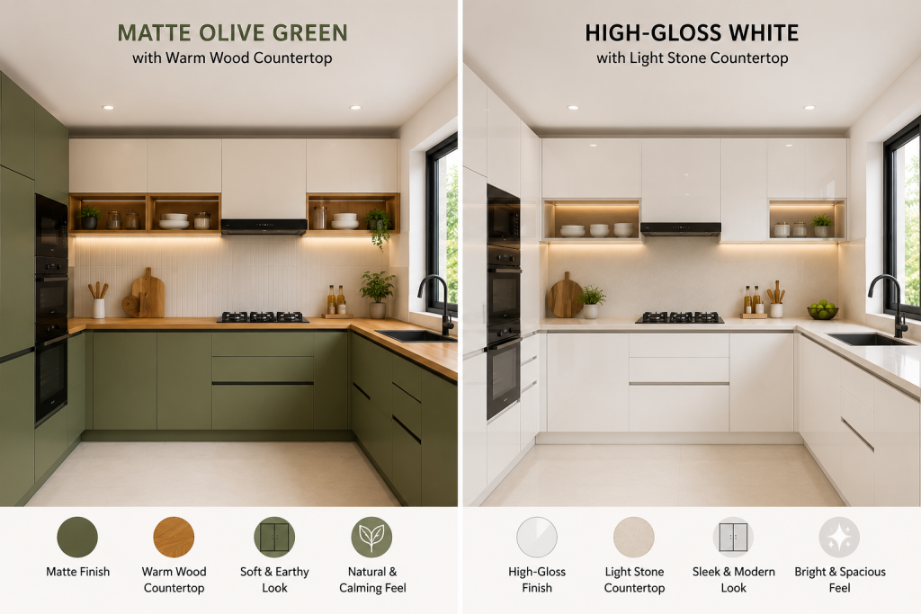
A kitchen that sees three Indian meals a day-with mustard, turmeric, and oil-has different practical demands than one used occasionally. Matte-finish laminates in mid-tone shades hide daily marks better than high-gloss white, which shows every fingerprint and spatter clearly.
Small Modular Kitchen Color Combination: What Actually Works
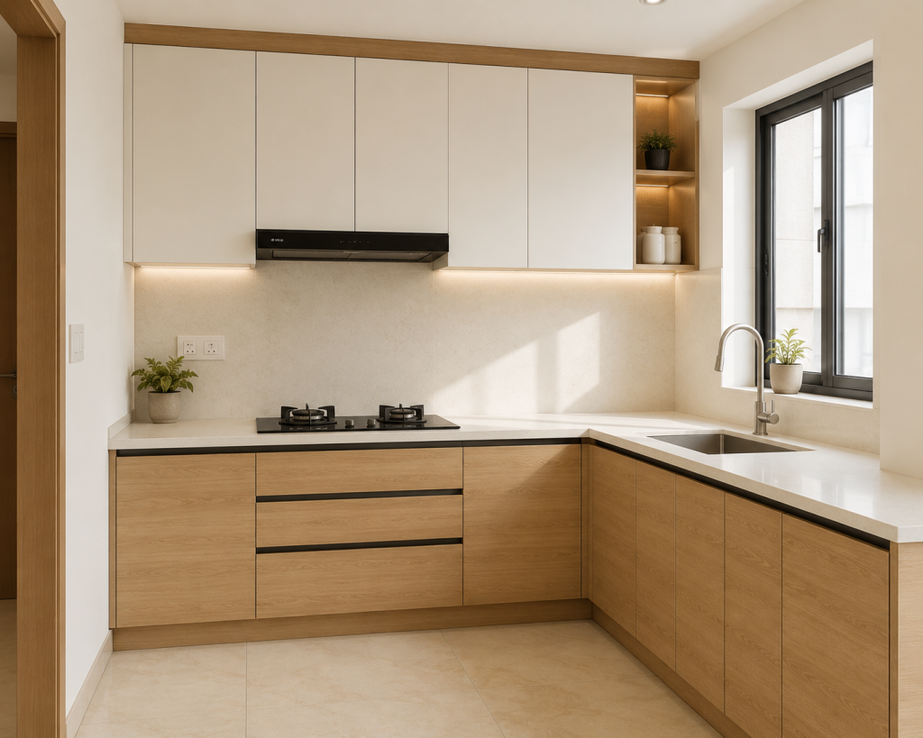
For compact kitchens in Dehradun apartments or Noida 2BHK flats, the most effective small modular kitchen color combination uses a light, reflective tone for the uppers and a slightly warmer mid-tone for the lowers. White or cream upper cabinets with a pale wood-finish base is one of the most practical choices available-it creates visual lift, avoids a claustrophobic feel, and still has enough warmth to make the space feel inviting rather than clinical.
Avoid placing dark colours across all surfaces (uppers, lowers, walls, and ceiling) in a small kitchen design. One dark surface as an accent-the lower cabinets or one backsplash wall-adds depth without shrinking the room visually.
How Natural Light Changes Your Colour Perception
A laminate that looks like deep olive green in a showroom under LED lighting may appear almost brown in a kitchen lit with warm incandescent bulbs. Therefore, always request laminate samples and hold them in your actual kitchen at different times of day before committing. This step matters especially for trending 2026 shades like sage green, olive, and warm taupe-all of which shift considerably depending on light source and direction.
The 8 Most Trending Modular Kitchen Color Combinations for 2026
These are the palettes dominating the 2026 modular kitchen conversation in India-chosen not for trend alone, but for how they perform in real Indian kitchens with real cooking demands.
1. White + Warm Wood Tone (Timeless, Works Everywhere)
White combined with warm wood-finish laminates remains the most versatile modular kitchen color combination in 2026. It works across kitchen sizes, suits Scandinavian and modern design styles, and ages well without feeling dated. In a Dehradun flat with a mountain view, this combination reads as clean and airy. In a Noida apartment, it makes the space feel larger than it actually is.
Choose HDMR board with a matte white acrylic or laminate front for the upper cabinets, and a warm walnut or oak wood-finish laminate for the base units. The material choice matters here: HDMR resists humidity better than MDF, which is particularly important in hill-region homes where moisture levels fluctuate seasonally.
2. Sage Green + Cream (Nature-Inspired, Trending Strongly)
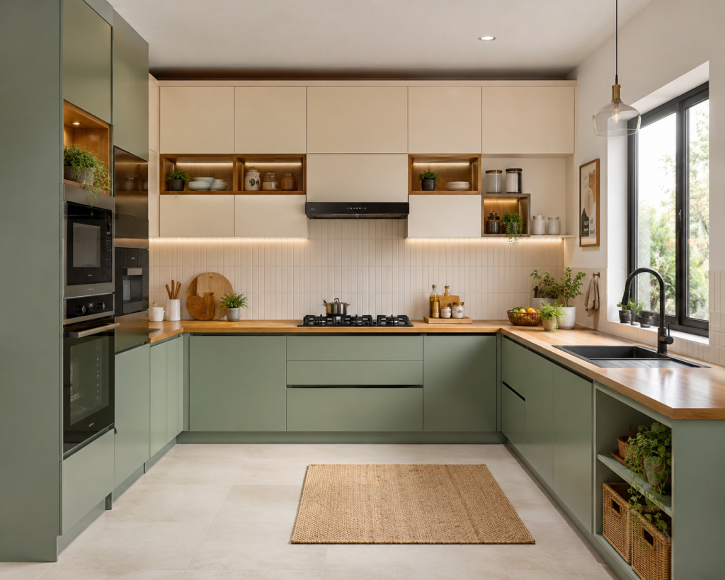
Sage green has emerged as one of the most discussed modular kitchen colour combinations of 2026 across Indian design conversations. Paired with cream or off-white upper cabinets, it creates a biophilic palette-one that connects your kitchen to a sense of nature without being loud about it. This combination is particularly well-suited to kitchens with large windows or those that open to a balcony or garden. Use matte-finish laminate for the sage green to avoid the colour reading as artificial under kitchen lighting.
3. Navy Blue + White (Modern Coastal, High Drama)
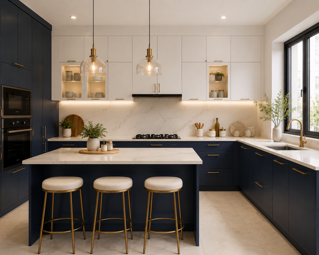
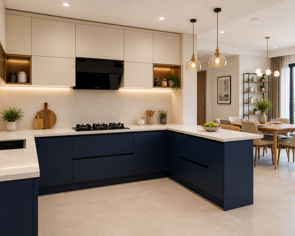
Deep navy blue on the lower cabinets with crisp white on the uppers is one of the strongest two colour combinations for kitchen laminates in the premium segment. The visual logic is clear: dark at the base anchors the space, while white on top lifts it. Adding Haefele or Blum pull handles in brushed brass elevates the combination further. This palette is especially effective in open-plan kitchens where the cooking zone flows into a dining or living area.
4. Charcoal Grey + Walnut Brown (Urban, Bold)
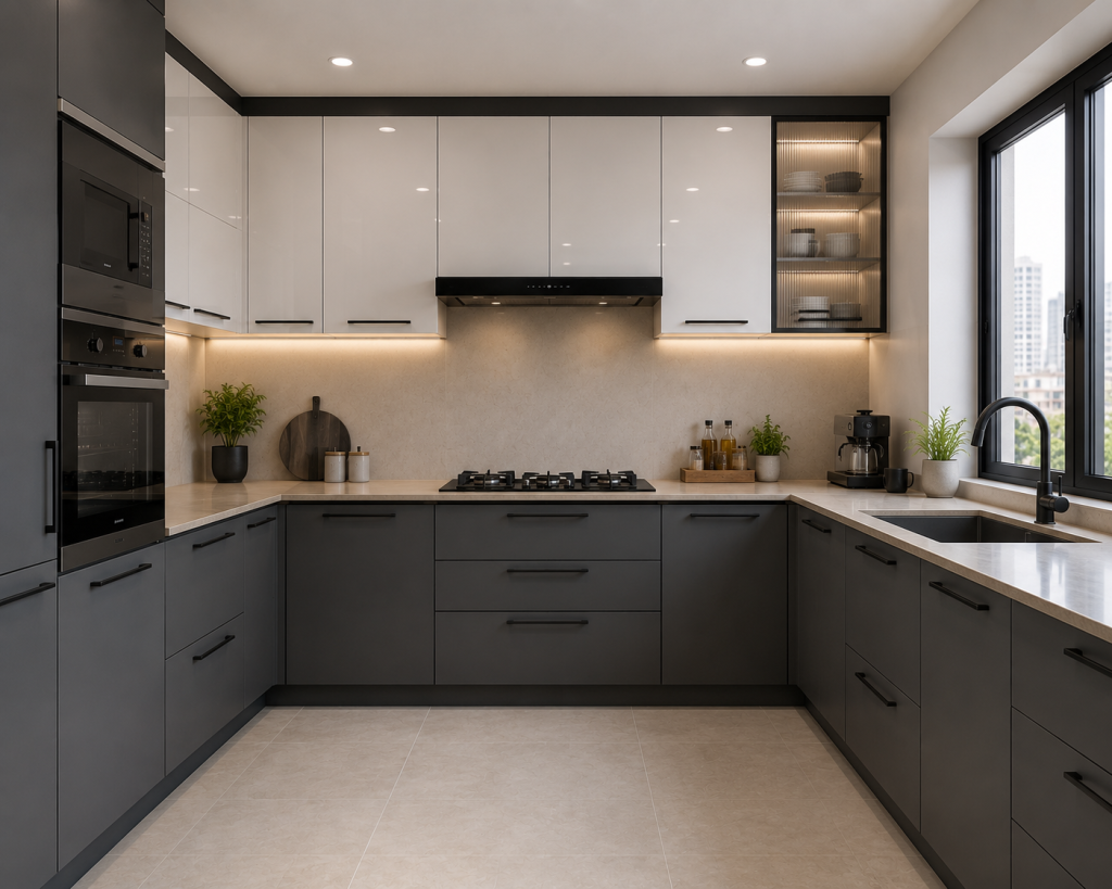
Charcoal grey and walnut brown is the choice for homeowners who want their kitchen to feel confident and contemporary without venturing into full matte-black territory. Grey hides marks and grease better than white-a practical advantage for heavy Indian cooking. The walnut tone adds warmth, preventing the palette from reading as cold or industrial.
5. Warm Taupe + Brushed Brass (Soft Luxury)
Taupe-a nuanced blend of grey and beige-is gaining ground as a refined alternative to either plain beige or plain grey. Paired with brushed brass hardware from Haefele or GRASS, it reads as quietly luxurious. This combination suits larger kitchens best, because taupe can feel slightly heavy in very small spaces. However, when used with good under-cabinet lighting and a light stone countertop, it works even in medium-sized parallel kitchen layouts.
6. Olive Green + Off-White (Calm, Earthy)
As an extension of the sage green movement, olive green brings a slightly deeper, more complex tone to the kitchen. It is more saturated than sage but still far from harsh. Off-white upper cabinets balance it effectively and prevent the palette from becoming oppressive. This combination is increasingly popular in Haridwar and Rishikesh, where homeowners are drawn to earth-connected palettes that complement natural wood floors and stone-tile finishes.
7. Pastel Blue + Light Grey (Soft, Contemporary)
Pastel or dusty blue paired with light grey is a refreshing modular kitchen color combination for families who want colour without high commitment. The palette is calm, easy to live with daily, and works particularly well in kitchens with white appliances. Moreover, both colours hide everyday smudges better than pure white, making this a sensible choice for active cooking households.
8. Matte Black + Natural Wood (Premium, Statement)
Matte black kitchens have arrived in the Indian mainstream-but they work best when offset with natural wood warmth. A wood-finish island countertop, open shelving in a walnut tone, or warm wooden flooring creates continuity between the kitchen and the living area. On their own, matte black cabinets can feel heavy. With natural wood as a counterbalance, the result is among the most luxurious kitchen aesthetics of 2026.
Two Colour Combination for Kitchen Laminates-What Actually Works
Two-tone kitchens-different colours applied to upper and lower cabinets-are among the most popular modular kitchen design choices of 2026. However, the logic behind which colour goes where matters more than most buyers realise.
The visual rule is clear
The heavier, darker colour anchors the base; the lighter, airier colour sits above. This creates groundedness at the bottom and openness at the top, mirroring how well-designed interiors balance visual weight. In practical terms, it is also the maintenance-smart choice. Lower cabinets face more daily wear-scuff marks, hands reaching in, contact with cleaning cloths-and a darker or textured laminate shows these marks less readily than a pale colour would.
Best Sunmica Colour Combination for Kitchen Cabinets
The term “sunmica” (a widely used Indian trade name for decorative laminates) covers a broad range of finishes. For kitchen use, the most durable Sunmica colour combinations pair a matte or satin finish on the lower cabinets, where handling is most frequent, with a gloss or semi-gloss finish on the uppers, which reflect light downward and help the space feel brighter.
Reliable combinations in this format include:
- Matte navy lower + high-gloss white upper
- Matte walnut wood grain lower + matte off-white upper
Matte charcoal lower + satin cream upper
Two-Tone Kitchen: Upper and Lower Cabinet Rules
A few principles worth following before finalising any two-tone modular kitchen upper lower cabinet design:
- Keep the contrast proportionate. A very dark lower combined with a very bright upper creates high contrast that can feel busy. A mid-tone lower paired with a bright upper reads as more balanced.
- Ensure the hardware bridges the two colours. A brushed gold handle ties warm palettes together; a matte black handle bridges cool combinations and lends a modern edge.
- Always check the combination under your kitchen’s actual lighting-not the showroom’s. Laminate shades shift significantly between warm LED, cool white, and natural daylight.
Matte vs Gloss Finish: Which Works Better for Indian Kitchens?
Finish choice is inseparable from colour choice in a modular kitchen. A sage green in matte laminate and the same sage green in gloss acrylic are functionally and visually different products, so understanding the distinction before choosing helps prevent a mismatched outcome.
Matte finishes
Hide fingerprints and light surface scratches better than any other option. They also make bold colours feel more sophisticated and subdued-which is why the 2026 trend toward sage green, olive, and charcoal strongly favours matte. The trade-off is that matte surfaces can absorb cooking grease over time if not cleaned regularly; a dry cloth wipe-down after cooking keeps them looking their best.
Gloss and acrylic finishes
They are easier to wipe clean and reflect light well, making small kitchens appear brighter. However, they show fingerprints immediately and are more prone to visible scratching. For kitchens with children, or those seeing three Indian meals a day, a satin or semi-gloss finish is often the most practical middle ground-easy to clean, more forgiving about daily marks.
Expert Tip
In Dehradun, Haridwar, and other kitchens in Uttarakhand-where humidity varies significantly during monsoon months-HDMR board (moisture-resistant board) is the recommended substrate for cabinets, regardless of the laminate or acrylic finish on top. MDF is more budget-friendly, but it absorbs moisture more readily over time. The surface finish looks identical in both; what differs is how the board behind it behaves after three to five monsoon seasons.
How to Choose a Colour Based on Your Kitchen Layout
Different kitchen layouts have different spatial dynamics, which means the same colour combination reads very differently depending on the layout you have.
Layout | Recommended Colour Approach | Why It Works |
Straight (single wall) | Light uppers + light lowers in the same tone | Maintains visual flow along one unbroken wall |
Light uppers + mid-tone lowers or two-tone scheme | Differentiates the two working walls subtly | |
Light reflective tones on both sides | Prevents the corridor from feeling narrow and enclosed | |
U-Shaped | Light uppers + one accent lower on the sink wall | Adds focal interest without overwhelming the space |
Bold accent on island + neutral main cabinets | Island becomes the natural visual anchor | |
Same light tone throughout; one accent surface maximum | Minimises visual breaks to expand perceived space |
For Noida apartments where parallel and L-shaped kitchens are most common, the most practical modular kitchen color combination is a white or cream upper with a warm mid-tone lower. This maximises perceived width and light reflection without requiring frequent cleaning to look presentable.
What to Check Before Choosing a Manufacturer for Your Modular Kitchen
Colour is the most visible part of a kitchen. However, what holds that colour in place-the board quality, laminate grade, edge banding, and hardware-determines whether your kitchen still looks as good in year five as it did on installation day.
Here is a practical checklist to use when comparing any modular kitchen manufacturer:
Material and Board Quality
Board quality: Ask specifically whether the substrate is HDMR or MDF. Both accept the same laminates, but HDMR resists moisture absorption significantly better-a non-negotiable in kitchens in Dehradun, Haridwar, or Rishikesh where humidity varies seasonally.
Laminate grade: Not all laminates are made equal. Ask whether the brand uses standard-grade or high-pressure laminates (HPL). HPL laminates are denser and more scratch-resistant-relevant if you are choosing dark matte shades like charcoal or navy, where surface scratches catch the light against the grain.
Edge banding: The colour finish on cabinet edges can chip or peel if the banding quality is low. In a two-tone kitchen, a mismatched or peeling edge is immediately visible. Therefore, ask for a sample cabinet with the edge exposed before committing to any colour or finish combination.
Hardware, After-Sales, and Visualisation
Hardware origin: Premium hardware from Blum, Haefele, or GRASS holds alignment and finish over thousands of open-close cycles. Low-cost drawer runners and hinges show failure within two to three years-particularly visible on dark-finished hardware, which looks premium when new but wears quickly at pivot points if the base quality is lacking.
After-sales process: Ask what the process is for replacing a single cabinet door or a damaged drawer front after installation. A manufacturer who makes kitchens in-house-rather than outsourcing production-can typically match a colour and finish more precisely during repairs or replacements.
3D visualisation: Ask whether a 3D design visualisation in your actual kitchen layout and dimensions is available before production begins. This step catches colour and proportion mistakes that are very expensive to correct after installation. If a provider cannot offer this, that is worth noting.
Common Mistakes to Avoid When Choosing Kitchen Colours
Even with a clear colour preference, a few recurring mistakes lead to outcomes that feel off once the kitchen is installed. Knowing them in advance can save a significant amount of frustration.
Choosing a colour from a 5 cm laminate swatch
A small chip and a full cabinet face are perceptually very different. Always request at least an A4-size sample before finalising any colour.
Ignoring the countertop and backsplash
The cabinet colour is only one layer of the combination. A navy-and-white kitchen looks very different with a white quartz countertop versus a black granite one. Plan all three surfaces together, not separately.
Selecting colours under showroom lighting
Showroom lighting is typically warm and flattering. Take your laminate sample home and observe it in your actual space at different times of day before making a commitment.
Choosing a very on-trend colour without considering longevity
Terracotta and mustard are bold choices that look striking in photographs. However, consider whether you will still enjoy them daily after three years. Neutral bases with a trend colour used only on the island or one accent wall tend to age better and remain livable longer.
Skipping a 3D visualisation
Most professional modular kitchen manufacturers can generate a 3D render of your colour combination in your actual kitchen dimensions before production begins. This step catches mistakes that are difficult and expensive to fix after installation.
Common Mistake Box
Many homeowners finalise a kitchen colour combination from a physical catalogue under office lighting, then feel surprised when the installed kitchen looks different. The fix is simple: request a 3D design visualisation in your room’s actual proportions, and always view laminate samples in your kitchen’s real light before signing off.
Modular Kitchen Color Combinations That Work Well in Dehradun, Noida, and Haridwar
Every region has its own combination of light quality, apartment typology, and kitchen usage patterns. As a result, the same colour combination will read differently depending on where you live.
Dehradun
Hill-region light is generally bright and clear, particularly in homes on Rajpur Road, Sahastradhara Road, and the Shimla Bypass corridor. This quality of light means stronger colours-deep navy, olive green, charcoal-stay vivid rather than washing out. Additionally, kitchens here face humidity fluctuations during monsoon, making HDMR board a sensible choice under any finish. Earth tones and biophilic combinations-sage green + cream, olive + off-white-feel especially fitting given the natural surroundings. If you are planning a kitchen in this region, explore Bhumim’s Dehradun-specific kitchen designs for ideas calibrated to local light and climate.
Noida
Urban apartment kitchens in Noida often have limited natural light due to taller surrounding buildings. As a result, lighter palettes-warm whites, pale beiges, cream with wood tones-are the most forgiving choices. Two-tone combinations with a lighter upper are particularly useful here for maximising the sense of space. For Noida-specific inspiration, Bhumim’s Noida kitchen projects offer practical direction for urban apartment planning.
Haridwar and Rishikesh
Homes here tend to favour designs that feel connected to nature. Earthy combinations-olive green, warm taupe, terracotta accents with off-white-suit both the aesthetic preferences and the strong natural light typical in these cities. Matte finishes over HDMR board are the practical choice given the monsoon-season humidity.
Frequently Asked Questions
For most Indian homes, white or cream upper cabinets paired with a warm wood, navy, or sage green lower unit is the most balanced choice. It reflects light, suits heavy Indian cooking demands, and remains stylish over time. The exact choice depends on kitchen size, natural light direction, and the countertop material already in place.
In 2026, the most popular colours for modular kitchens in India include sage green, warm taupe, navy blue, olive green, charcoal grey, and warm white with wood tones. Matte finishes in earthy, nature-inspired tones are especially dominant this year, replacing the glossy all-white kitchens of the previous decade.
The most effective two colour combination for kitchen laminates places a darker or mid-tone matte laminate on the lower cabinets-where daily wear and marks are most common-and a lighter, brighter laminate on the upper cabinets. Reliable combinations include matte navy + gloss white, matte walnut + off-white, and charcoal grey + cream satin.
For a small modular kitchen, the best approach uses light, reflective tones throughout-cream, pale beige, soft white, or light wood-and avoids dark colours on more than one surface. Using the same light tone across upper cabinets, lower cabinets, and walls reduces visual breaks and makes the kitchen feel significantly larger.
Not necessarily. Two-tone kitchens-different colours on the upper and lower cabinets-are a popular and practical design choice. The key principle is to place the lighter tone on the upper cabinets and the darker tone below, which maintains correct visual balance. A single colour throughout is also a valid choice, particularly in small kitchens where one tone across all surfaces reduces visual clutter and simplifies the space.
For Indian kitchens where cooking is frequent, matte or satin-finish laminates are generally more practical than high-gloss. They hide fingerprints and daily marks better, though they require regular dry-cloth wiping to prevent grease from building up. High-gloss finishes wipe clean easily but show every smudge. A semi-gloss or satin finish is often the most practical middle ground for high-use kitchens.
Pairing a matte or textured sunmica laminate on the lower cabinets with a smoother, lighter-toned laminate on the uppers gives the best result overall. Popular sunmica combinations include walnut wood grain + soft white, matte grey + cream gloss, and navy matte + warm off-white. In each case, the texture contrast adds depth without the combination feeling forced.
Natural light significantly changes how a colour reads on a surface. Warm or indirect light in north-facing kitchens makes cool colours like pale grey or soft blue appear flat; in these spaces, warm creams and wood tones perform better. Strong direct light in south- or east-facing kitchens allows bolder colours-navy, olive green, charcoal-to stay vivid without feeling heavy. Always hold laminate samples up in your kitchen’s actual light before finalising any colour.
Yes, and it is one of the most effective steps you can take before signing any production agreement. A 3D visualisation in your actual kitchen layout and dimensions shows you how your chosen colour combination will look on the walls, countertops, and cabinets together-under your kitchen’s real proportions. Most professional modular kitchen manufacturers offer this before production begins. If they do not, asking why is a reasonable question.
Key Takeaways
- Matte earthy tones define 2026: Sage green, olive, warm taupe, navy blue, and charcoal grey are the defining kitchen palettes of this year.
- Two-tone is practical, not just pretty: Dark lower + light upper is a maintenance-smart choice that hides wear where it occurs most.
- Finish matters as much as colour: Matte hides daily marks; gloss cleans easily. Satin is often the best middle ground for high-use Indian kitchens.
- HDMR board is the right substrate for humid climates, including Dehradun, Haridwar, and Rishikesh, regardless of the laminate or acrylic applied on top.
- Small kitchens need light, consistent tones-one accent surface at most-to avoid visual crowding.
- Always view laminate samples in your actual kitchen space before finalising. Showroom lighting is consistently more flattering than real conditions.
- Request a 3D visualisation before production begins. It is the most reliable way to prevent costly post-installation regrets.
Conclusion
You likely started this search holding a few laminate swatches, a rough idea of what you liked, and a genuine uncertainty about whether it would all come together. That is exactly where colour decisions in modular kitchens begin-and where they most often go sideways without the right information behind them.
The 2026 modular kitchen colour combination trends offer something useful to almost every kind of Indian home: earthy, nature-connected palettes for Dehradun hill-region properties; crisp two-tone schemes for Noida apartment kitchens; and warm, grounded combinations for Haridwar and Rishikesh homes where living close to nature is a real design priority. Getting the colour right is only half the decision. The other half is making sure it is applied to materials-HDMR board, high-quality laminate, the right surface finish-that keep the kitchen looking as good in year five as it does in the installation photographs.
If you are planning a modular kitchen in Dehradun, Noida, Haridwar, Rishikesh, Roorkee, or Ghaziabad and want to see how your chosen colour combination actually looks in your specific kitchen layout before any production begins, Bhumim offers a free 3D design consultation. Reach out via WhatsApp or the contact form on bhumim.com to book yours-and see your kitchen on screen before a single cabinet is cut.